Concept:
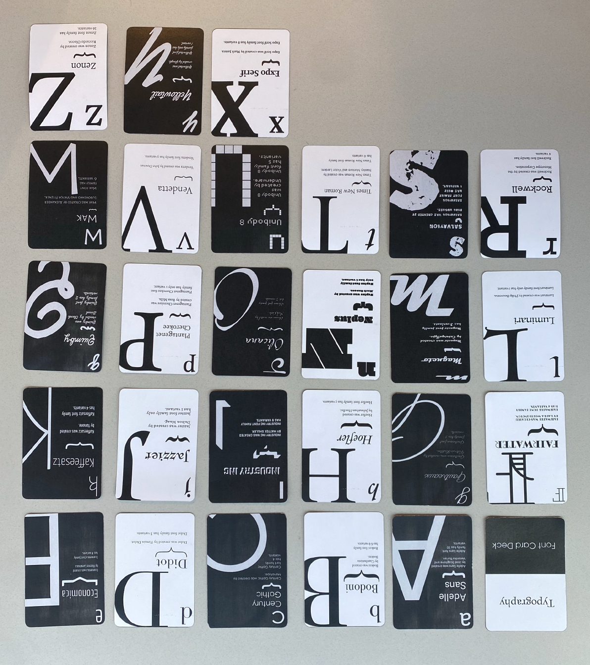
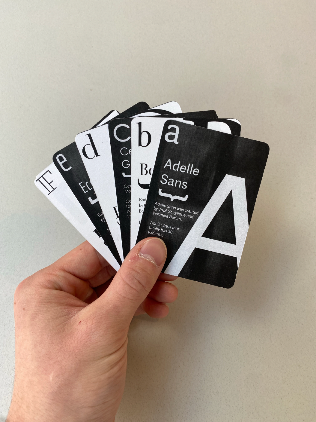
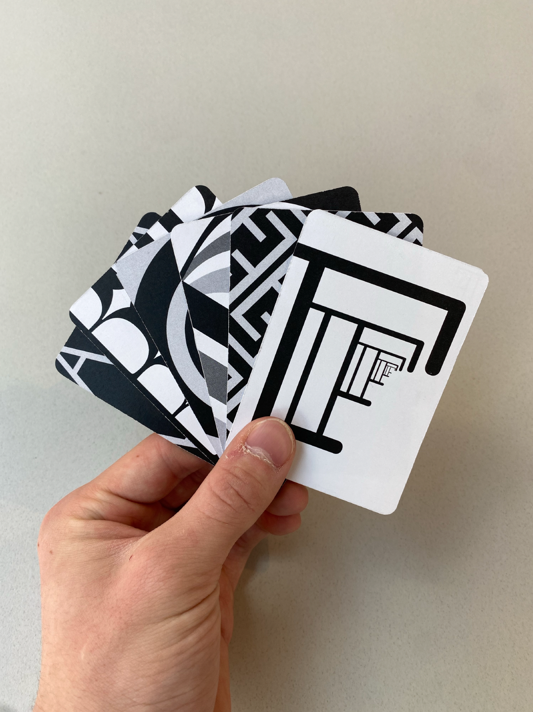
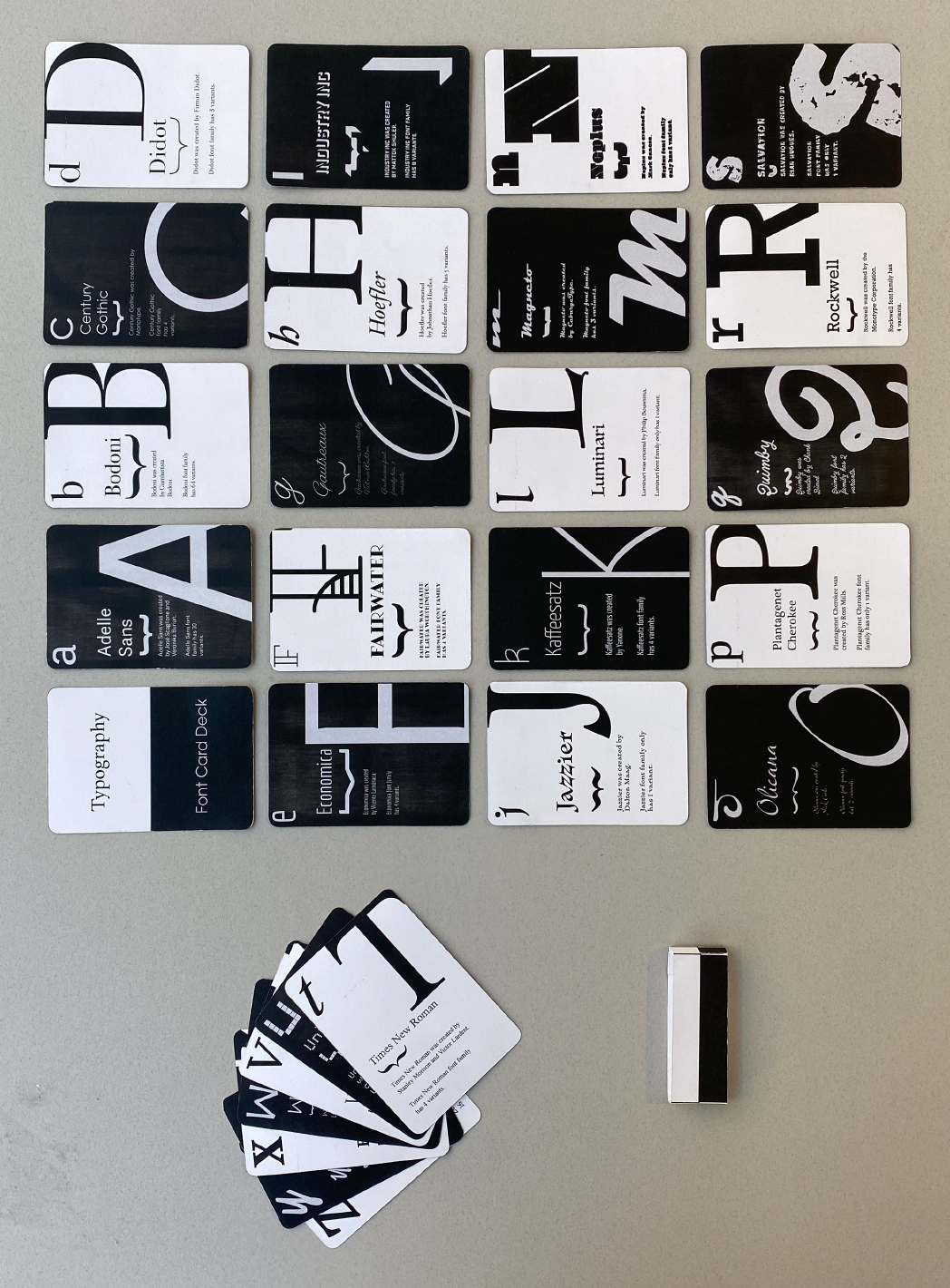
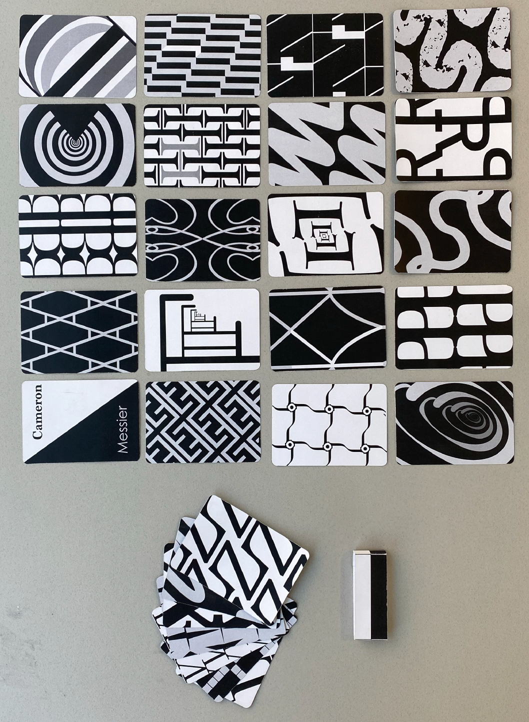
The typographic card deck is a unique fusion of design and education, presenting a deck of cards inspired by traditional playing cards but reimagined to showcase serif and sans-serif fonts. Each card features intricate patterns on the back and a brief history of the font it represents. By splitting the designs into two contrasting sets of 13, the project explores typography through dynamic visual storytelling.
Approach:
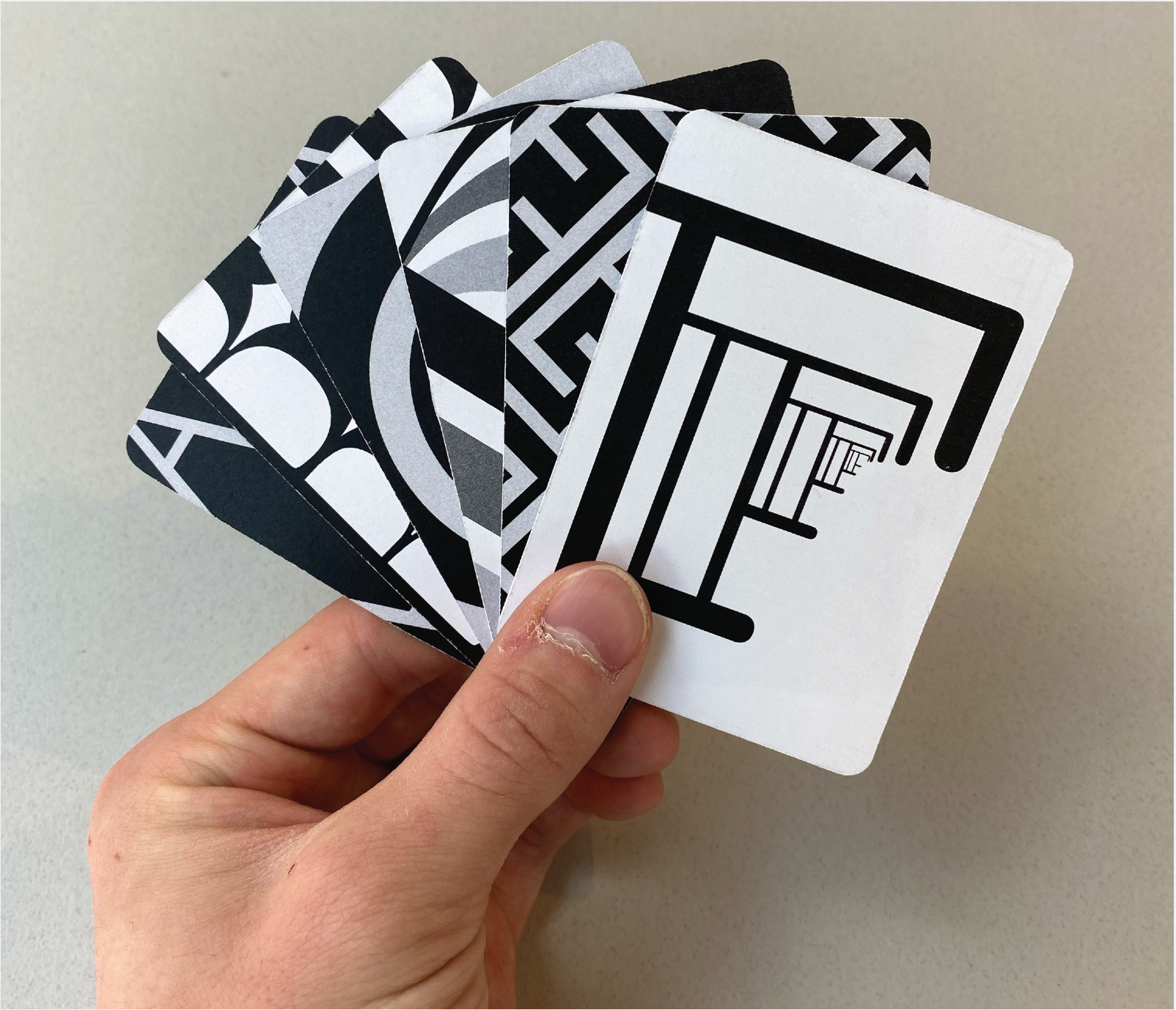
From the beginning, I aimed to create a striking contrast between the serif and sans-serif cards. To achieve this, I designed the sans-serif cards with a sleek black-and-gray palette, while the serif cards featured a crisp white-and-black scheme. This opposition extended to the placement of typography and visual elements on the cards, emphasizing their differences. Designing the intricate patterns on the backs of the cards was an intuitive and enjoyable process, bringing cohesion and elegance to the overall design.
Final Product:
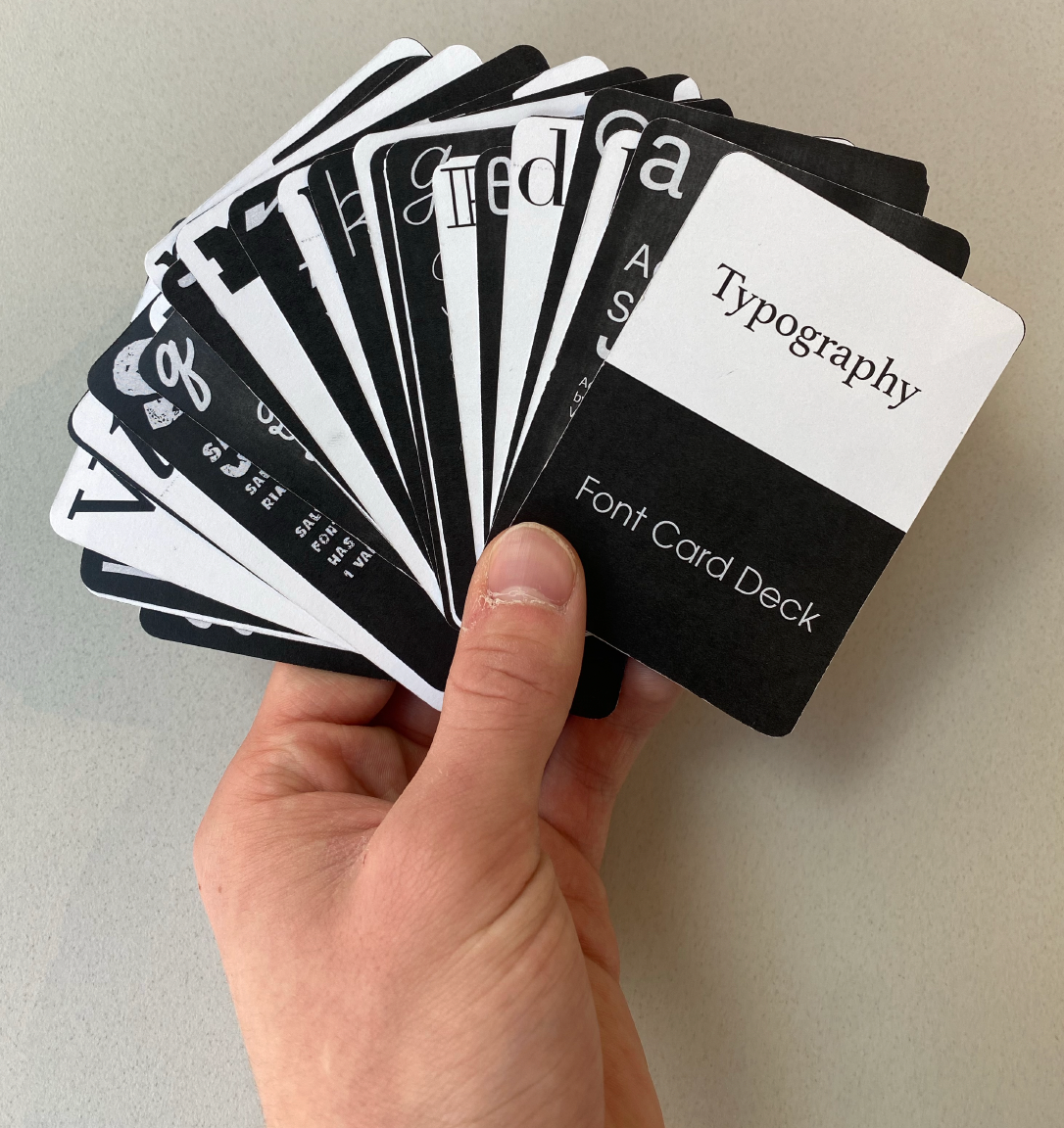
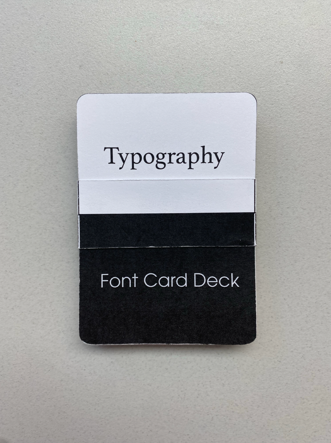
The final deck of cards was crafted using Adobe Illustrator for the intricate patterns and Adobe InDesign to optimize the layout and printing process. Each card was meticulously rounded at the corners for a professional finish, and a custom-designed band was created to hold the deck together. These thoughtful details ensured the deck exuded sophistication, making it both an engaging educational tool and a visually compelling design piece.
